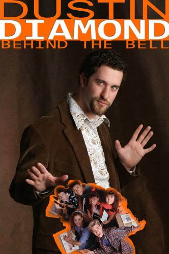
Do we even need to say why? Just look at this crap. It looks like Dustin Diamond designed it himself. Here's why:
1. Forced pose. Diamond looks like he's trying to be the next David Copperfield, or it's a really bad Zack Morris impression.
2. Stretched, generic font. People who have no clue about design won't notice it. But we do, and it kills us.
3. Ganking from Google Images. Dude, you were on the show. You should have six of those photos on your fridge.
4. Bad use of Photoshop stroking. Congratulations, Dustin. You've created a candidate for the Photoshop Disasters hall of fame. SOURCE