Read a little. Learn a lot. • Tightly-written news, views and stuff • Follow us on TwitterBe a Facebook FanTumble us!

28 Aug 2009 10:12

tags

Biz: IKEA’s Verdana backlash: The Swedes didn’t see it coming

  • It’s more efficient and cost-effective. Plus, it’s a simple, modern-looking typeface. … I think it’s safe to say we were surprised by the response.
  • IKEA spokeswoman Monika Gocic • On the unthinkable change in font from IKEA’s iconic Futura variant to Verdana. The story’s starting to pick up some (trendy but cheap and wobbly) legs in the mainstream press, with Time now giving the story a little more exposure. Time did a good job covering the angles as to why Verdana sucks – it’s overused, it was designed for small sizes on the Web, and it’s way too associated with Microsoft. Hopefully the nudge in the press might help the company reconsider. • source

28 Aug 2009 10:02

tags

Biz: Cash For Clunkers put consumer spending ahead last month

  • 0.2% consumer spending increase in July; clunkers helped source

27 Aug 2009 11:08

tags

Biz, U.S.: The national GDP is down, but not as bad as experts feared

  • -1% decline in Gross Domestic Product in the second quarter source

27 Aug 2009 10:30

tags

Biz: Bud Light’s “fan can”: Wearing team colors like a fairweather fan

  • Bud Light, which may as well be water, came up with this “Fan Can” idea to market beers in team colors just as college football season was starting up. Why support one team when you can support the whole Big Ten? source
  • The FTC isn’t keen on Bud’s idea, because it may lead to underage drinking. (Uh, whatever.) The schools themselves are ticked because the colors make it seem like they’re supporting crappy light beer. So are we. source

27 Aug 2009 10:07

tags

Biz: New AIG CEO Robert Benmosche: It’s a WORKING vacation!

  • People criticize me for being on vacation. I actually started work a week before I was actually supposed to. I do have conference calls every day, I have all my information sent here. I can work here as well as in the office in New York.
  • New AIG CEO Robert Benmosche • On his working vacation, which began only a few days after he took on the title of head guy of America’s Favorite Company. (Previously, he headed MetLife, the country’s largest insurer.) So, where did he chose to go? Sunny, beautiful Croatia. Quick, bail him out! • source

26 Aug 2009 21:56

tags

Biz: Toyota just recalled a ton of cars with brake problems

  • 95,700 Toyota & Scion cars recalled source

26 Aug 2009 21:01

tags

Biz, World: IKEA changed their fonts to reach Chinese *yawn* customers

Futura didn’t have an extended character set like Verdana does. How do the Chinese repay them? By loitering in their stores. source
 

26 Aug 2009 20:46

tags

Biz: Verdana is not a font. We repeat, IKEA: Verdana is not a font.

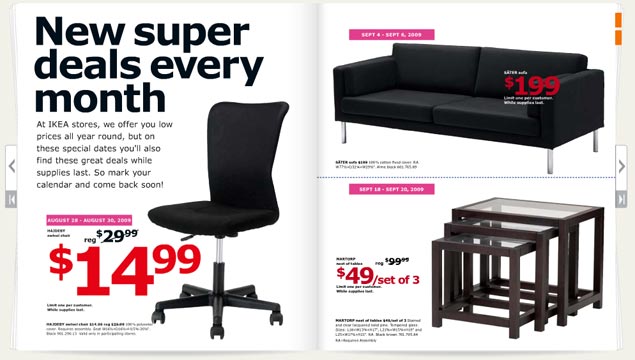
The 2010 IKEA catalog

Verdana is a mistake. With all apologies to noted typographer Matthew Carter (who we saw speak a couple of years ago and have a lot of respect for), Microsoft has ruined his most well-known font. Its use has become such a sign of amateurism that we consider it a mistake. So its usage in the IKEA catalog, above, requires us to complain. Loudly.
  • Where it looks good Microsoft’s Web site. Internet Explorer interfaces. Computer screens. Body type. That’s about it. source
  • Where it looks good Microsoft’s Web site. Internet Explorer interfaces. Computer screens. Body type. That’s about it.
  • Where it looks bad Just about everywhere the IKEA catalog uses it. Big type. Bad tracking. The kerning sucks. The corners that make the font so distinctive turn in ways that scream personality in all the wrong ways. The catalog looks like something a first year design student at ITT Tech would make, which is the harshest criticism we could come up with. It looks like the font blew out when the catalogs were being printed. source
  • Where it looks good Microsoft’s Web site. Internet Explorer interfaces. Computer screens. Body type. That’s about it.
  • Where it looks bad Just about everywhere the IKEA catalog uses it. Big type. Bad tracking. The kerning sucks. The corners that make the font so distinctive turn in ways that scream personality in all the wrong ways. The catalog looks like something a first year design student at ITT Tech would make, which is the harshest criticism we could come up with. It looks like the font blew out when the catalogs were being printed.
  • The font in context Carter designed this typeface (along with Tahoma and Georgia) for a specific purpose in 1994 – to look good on a computer screen. A lot has changed since 1994. Most notably, we use LCD screens, not CRTs. Improved font rendering makes screens look nearly as good as print. We don’t need Verdana anymore. IKEA needs Futura, an iconic font it used for 50 years. Stupid Swedes. source

26 Aug 2009 11:16

tags

Biz: New home sales bounced back big-time in July

  • 9.6% jump in new home sales, the biggest in four years source

26 Aug 2009 10:50

tags

Biz, U.S.: A giant business lobby wants a Scopes trial for global warming

  • The U.S. Chamber of Commerce: Full of jerks who hate science. When millions of businesses band together under one massive umbrella to fend off scientific theories with lots of evidence, expect people like us to take notice. The massive business lobby, trying to avoid tightened emissions regulations, wants to have the Environmental Protection Agency to hold a trial on man-made global warming. We hope, just like the Scopes trial, it’s a circus. source