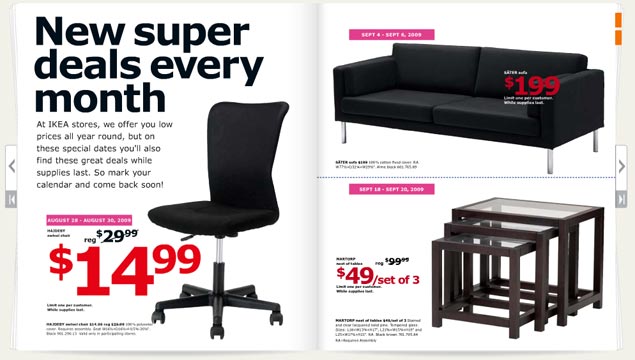
Biz: Verdana is not a font. We repeat, IKEA: Verdana is not a font.
- Where it looks good Microsoft’s Web site. Internet Explorer interfaces. Computer screens. Body type. That’s about it. source
- Where it looks good Microsoft’s Web site. Internet Explorer interfaces. Computer screens. Body type. That’s about it.
- Where it looks bad Just about everywhere the IKEA catalog uses it. Big type. Bad tracking. The kerning sucks. The corners that make the font so distinctive turn in ways that scream personality in all the wrong ways. The catalog looks like something a first year design student at ITT Tech would make, which is the harshest criticism we could come up with. It looks like the font blew out when the catalogs were being printed. source
- Where it looks good Microsoft’s Web site. Internet Explorer interfaces. Computer screens. Body type. That’s about it.
- Where it looks bad Just about everywhere the IKEA catalog uses it. Big type. Bad tracking. The kerning sucks. The corners that make the font so distinctive turn in ways that scream personality in all the wrong ways. The catalog looks like something a first year design student at ITT Tech would make, which is the harshest criticism we could come up with. It looks like the font blew out when the catalogs were being printed.
- The font in context Carter designed this typeface (along with Tahoma and Georgia) for a specific purpose in 1994 – to look good on a computer screen. A lot has changed since 1994. Most notably, we use LCD screens, not CRTs. Improved font rendering makes screens look nearly as good as print. We don’t need Verdana anymore. IKEA needs Futura, an iconic font it used for 50 years. Stupid Swedes. source
