Read a little. Learn a lot. • Tightly-written news, views and stuff • Follow us on TwitterBe a Facebook FanTumble us!

11 Jun 2010 11:38

tags

Culture: Dear Michael Jordan: Lose the Hitler mustache, dude

  • This has actually been bothering us for a while. MJ may be the retired king of the basketball court, but it doesn’t mean he can get away with anything. This ‘stache of his, which he’s been wearing for a while, actually, randomly started getting attention after he wore it in this Hanes ad. Dude. It looks stupid. There, we said it. Charles Barkley (hilariously) agrees with us: “That is one of the stupidest things that I have seen in a long time,” he said recently. source


11 Jun 2010 01:29

tags

Tech: Google’s real problem with their background images: No balance

Why did everyone hate Google putting background images on their site yesterday? Because, unlike Bing, they grafted the idea onto the old design (poorly). source

01 Jun 2010 21:49

tags

World: Troubled Japanese Prime Minister Yukio Hatoyama resigns

  • It was the shirt, wasn’t it? Yukio Hatoyama, Japan’s prime minister, hasn’t had an easy time of it since he became PM last year, and it’s only gotten worse for him after he ditched a campaign pledge to get the U.S. military to move off Okinawa. His party afraid of losing some serious momentum, Hatoyama resigned tonight. Sucks to be him. source

25 Mar 2010 20:24

tags

Politics: Eric Cantor’s attack on Democrats feels kinda tasteless

  • When Eric Cantor gets up in the morning, does he get out of a pod? Is he covered in slime? Because, seriously, he sounds very slimy in this clip, where he suggests Democrats are trying to leverage attacks on them for political gain. Mr. Cantor, where did anyone suggest that a GOP leader led to these attacks? The bullet that Cantor’s referring to, by the way, appears to be a stray bullet shot into the air, according to the Richmond, Va. police department. source

04 Jan 2010 20:42

tags

Tech: Mashable’s redesign sucks. Yeah, we said it. What what?

  • They look like the establishment now. Mashable’s always had a lot of clutter in its design, due to the fact that they tended to try a lot of things and throw them on the wall and see if they worked. It’s what the site’s always been about. They did need a redesign, and we’re glad they’re trying. But we’d rather have the old design back than this slick hodgepodge that feels like absolutely nothing at all.
  • Why does it suck? The colors of this design are so quiet, so muted, so similar to Yahoo!’s longstanding mid-decade quiet tones, that it doesn’t make us feel anything. Also worth noting: The headshots, which emphasized that this was a personality-driven site, have been de-emphasized too much, creating an anonymous, generic feel.
  • Changes worth considering Mashable’s a popular site, but it could stand to be hipper (like Engadget, which just got a great redesign) or more playful (like Twitter, which drives much of the site’s traffic). It should have as much personality as the words of its jetsetting founder, Pete Cashmore. Cleaner doesn’t mean lifeless. Never forget that, kids.

26 Aug 2009 20:46

tags

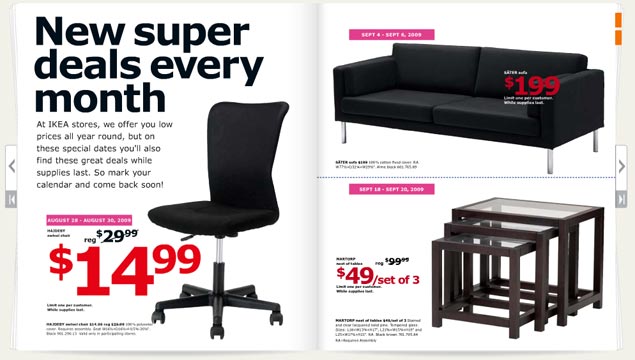
Biz: Verdana is not a font. We repeat, IKEA: Verdana is not a font.

The 2010 IKEA catalog

Verdana is a mistake. With all apologies to noted typographer Matthew Carter (who we saw speak a couple of years ago and have a lot of respect for), Microsoft has ruined his most well-known font. Its use has become such a sign of amateurism that we consider it a mistake. So its usage in the IKEA catalog, above, requires us to complain. Loudly.
  • Where it looks good Microsoft’s Web site. Internet Explorer interfaces. Computer screens. Body type. That’s about it.
  • Where it looks bad Just about everywhere the IKEA catalog uses it. Big type. Bad tracking. The kerning sucks. The corners that make the font so distinctive turn in ways that scream personality in all the wrong ways. The catalog looks like something a first year design student at ITT Tech would make, which is the harshest criticism we could come up with. It looks like the font blew out when the catalogs were being printed.
  • The font in contextCarter designed this typeface (along with Tahoma and Georgia) for a specific purpose in 1994 – to look good on a computer screen. A lot has changed since 1994. Most notably, we use LCD screens, not CRTs. Improved font rendering makes screens look nearly as good as print. We don’t need Verdana anymore. IKEA needs Futura, an iconic font it used for 50 years. Stupid Swedes. source

15 Aug 2009 13:16

tags

Politics: Yes or no? Rep. John Culberson spins hard on “Hardball”

  • Both sides look bad here to some degree – there’s smoke coming out of the ears of “Hardball’s” Lawrence O’Donnell, while Rep. John Culberson does everything he can to avoid saying “yes” or “no” to questions which circle around whether Medicare and Social Security are socialism, and how he can support them when he doesn’t support health care. It gets ugly, even for a political debate on “Hardball.” source
 

18 May 2009 22:03

tags

Offbeat, U.S.: Donald Rumsfeld is the worst Christian graphic designer ever

Imagine a crochety old guy with a lot of power designing these in Powerpoint. Then remember Obama’s branding campaign. Scary, eh? source