Read a little. Learn a lot. • Tightly-written news, views and stuff • Follow us on TwitterBe a Facebook FanTumble us!

09 Sep 2010 10:19

tags

Cats!: IKEA + Cats = Your Living Room (and also this cool ad)

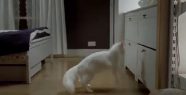
  • Ad people get to have more fun than you. See, a British ad firm working for IKEA got to fill one of their stores with a bunch of cats and tape it. Can you believe that this is someone’s job?Awww. (Thanks Andrew Ottoson) source
31 Aug 2009 21:16

tags

Culture: Beyond IKEA and Verdana: Other famous fontroversies

Now that the IKEA controversy has gone mainstream, the backlash against the backlash has begun; it’s even hit us. It’s not the first time. (See Helvetica.) source

28 Aug 2009 10:12

tags

Biz: IKEA’s Verdana backlash: The Swedes didn’t see it coming

  • It’s more efficient and cost-effective. Plus, it’s a simple, modern-looking typeface. … I think it’s safe to say we were surprised by the response.
  • IKEA spokeswoman Monika Gocic • On the unthinkable change in font from IKEA’s iconic Futura variant to Verdana. The story’s starting to pick up some (trendy but cheap and wobbly) legs in the mainstream press, with Time now giving the story a little more exposure. Time did a good job covering the angles as to why Verdana sucks – it’s overused, it was designed for small sizes on the Web, and it’s way too associated with Microsoft. Hopefully the nudge in the press might help the company reconsider. • source

26 Aug 2009 21:01

tags

Biz, World: IKEA changed their fonts to reach Chinese *yawn* customers

Futura didn’t have an extended character set like Verdana does. How do the Chinese repay them? By loitering in their stores. source

26 Aug 2009 20:46

tags

Biz: Verdana is not a font. We repeat, IKEA: Verdana is not a font.

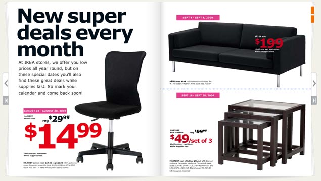
The 2010 IKEA catalog

Verdana is a mistake. With all apologies to noted typographer Matthew Carter (who we saw speak a couple of years ago and have a lot of respect for), Microsoft has ruined his most well-known font. Its use has become such a sign of amateurism that we consider it a mistake. So its usage in the IKEA catalog, above, requires us to complain. Loudly.
  • Where it looks good Microsoft’s Web site. Internet Explorer interfaces. Computer screens. Body type. That’s about it. source
  • Where it looks good Microsoft’s Web site. Internet Explorer interfaces. Computer screens. Body type. That’s about it.
  • Where it looks bad Just about everywhere the IKEA catalog uses it. Big type. Bad tracking. The kerning sucks. The corners that make the font so distinctive turn in ways that scream personality in all the wrong ways. The catalog looks like something a first year design student at ITT Tech would make, which is the harshest criticism we could come up with. It looks like the font blew out when the catalogs were being printed. source
  • Where it looks good Microsoft’s Web site. Internet Explorer interfaces. Computer screens. Body type. That’s about it.
  • Where it looks bad Just about everywhere the IKEA catalog uses it. Big type. Bad tracking. The kerning sucks. The corners that make the font so distinctive turn in ways that scream personality in all the wrong ways. The catalog looks like something a first year design student at ITT Tech would make, which is the harshest criticism we could come up with. It looks like the font blew out when the catalogs were being printed.
  • The font in context Carter designed this typeface (along with Tahoma and Georgia) for a specific purpose in 1994 – to look good on a computer screen. A lot has changed since 1994. Most notably, we use LCD screens, not CRTs. Improved font rendering makes screens look nearly as good as print. We don’t need Verdana anymore. IKEA needs Futura, an iconic font it used for 50 years. Stupid Swedes. source

27 Mar 2009 11:14

tags

Biz, Offbeat: Behind the curtain is an Ikea car. Maybe.

It could be an April Fool’s joke, but if it’s real: 1) We hope it’s pre-assembled and 2) In-dash Swedish meatball dispenser! source