Read a little. Learn a lot. • Tightly-written news, views and stuff • Follow us on TwitterBe a Facebook FanTumble us!

09 Dec 2011 13:49

tags

Tech: Nintendo’s Shigeru Miyamoto retiring, not retiring; honestly we’re not sure

  • Is Nintendo’s game-master retiring? Wired’s readers had reason to worry Wednesday after an article led them to believe that Shigeru Miyamoto, the company’s top game designer, would be stepping aside and working on smaller projects. (It was an easy conclusion to make: The headline was literally “Nintendo’s Miyamoto Stepping Down, Working on Smaller Games.” He also said, in these exact words: “I’m not saying that I’m going to retire from game development altogether. What I mean by retiring is, retiring from my current position.”) However, Nintendo denies the report; they told PC Magazine that, in his Wired interview, that “he attempted to convey his priorities moving forward, inclusive of overseeing all video game development and ensuring the quality of all products.” The company also noted that he wanted to take on smaller projects to rekindle his early love of making games. Were there translation issues? source

16 Aug 2011 11:05

tags

Politics: Huffington Post stirs up controversy with design crowdsourcing idea

  • When a company like Huffington Post or GAP employs crowdsourcing to get proprietary design work done for free, the result is almost always negative. To many designers, it’s the same as asking a plumber to do some work on the pipes and in lieu of a paycheck, they’ll just put up a sign in the bathroom acknowledging all of the plumber’s hard work. But as with any fight (or tango), it takes two. Huffington Post shouldn’t have asked for free work, and up-in-arms designers should understand that their own willingness to accept work on spec is what keeps this practice around.
  • Good Magazine senior editorial designer Dylan C. Lathrop • Taking both designers and The Huffington Post to task after HuffPo held a contest to have people redesign its logo for its politics section. Now, HuffPo isn’t the only publication to ever do this — but the problem is, they’re a very successful company that can afford to pay a designer to do this, and let’s face it — the pig needs a top-down coat of paint. The Gap tried something similar when people decided that they hated their logo redesign, and they felt the pain too. Fact of matter: If you’re a company that makes millions of dollars a year and has an audience larger than a couple of people, you can afford to pay your writers pay someone to design your logos. source

08 Oct 2010 12:57

tags

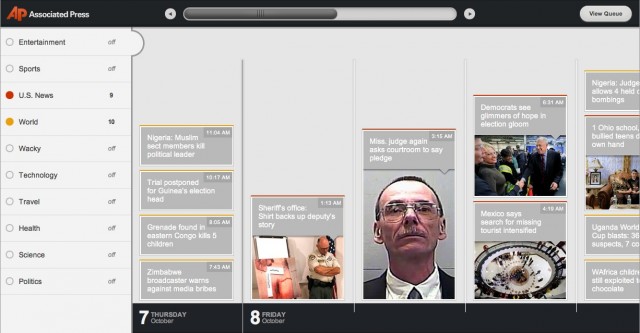
Tech: Associated Press creates HTML5 timeline app that doesn’t suck

  • Yo, AP, you should consider replacing your laughable child-like iPad app with this thing, because it’s actually kind of innovative and stuff. And it uses HTML5. Basically, this is the coolest thing the AP has ever done. source

14 Sep 2010 21:58

tags

Tech: Redesign! Twitter’s finally sprucing things up a little more

  • Looks like someone’s finally dealing with a sore spot! Twitter’s basic design had long been a sore spot for many using the service, and now they’re going to work on it, adding a bunch of multimedia elements and making the design overall more visual. We could see developers complaining about this like they did the Atebits acquisition; Brizzly, for example, just lost its main competitive advantage. The redesign rolls out over the next several weeks, and we’re guessing it’s going to go over a lot better than Digg’s. source

08 Sep 2010 11:07

tags

U.S.: Gulf oil spill: BP tries to shift some of the blame with report

  • The company just released a 193-page report on the spill. Claiming “a complex and interlinked series of mechanical failures, human judgments, engineering design, operational implementation and team interfaces,” BP’s new report tries to spread the blame in a number of places, noting some design flaws but also focusing more on the cement job on the well (done by Haliburton) and failings of the workers on the rig (who were Transocean employees) and trying not to shoulder all the blame themselves. Consider the report an attempt at shoring up PR and a preview of future court cases. source

31 Aug 2010 21:34

tags

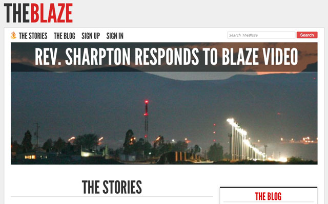
Politics: Glenn Beck’s “The Blaze”: Well, the design is kinda cool

  • Credit where credit’s due: The Blaze, clearly Glenn Beck’s attempt at a Huffington Post-style site, has a design that tops pretty much every site of its kind out there. HuffPo is an exercise in throwing a ton of crap on a single page. The Daily Caller, while it had an engaging pitch at launch, definitely had a by-the-numbers design that looked out of date before it had ever heard of Journolist. The Blaze, while sticking with WordPress, has a downright elegant, photo-heavy, type-focused look. Too bad it’s as adversarial and divisive as Beck can be. source

21 Jul 2010 20:53

tags

Tech: Flipboard: The iPad gets a well-designed (AND FAST) news aggregator

  • The thing we noticed with Pulse News Reader after using it for a month was that it got very slow eventually. Not so with Flipboard. This app, a social-media-focused iPad app, literally blazes on the iPad, making it feel like the most natural iPad news app out there. We seriously think they knocked this one out of the park. It’s currently the most popular free iPad app, and is so popular that they’re having trouble signing everybody up. That’s right, they have the digital version of a limited supply – they have API limitations. A good problem to have. source
 

19 Jul 2010 10:46

tags

U.S.: The Washington Post’s been busy the last two years or so

  • The amount of work that went into this is impressive. Beyond the stories themselves – an early Pulitzer contender about how the government’s intelligence apparatus has grown so huge that nobody knows how big it is – is an immaculately-designed mini-site, full of huge amounts of data about where all that intelligence money goes. It includes a pretty smart use of the jQuery carousel feature, immersive graphics (above), and data to last you for weeks. The Post has long been the ugliest of major old-guard newspapers, cluttered in all the ways that the Post itself is clean and classy. This – to us – proves that they have the capacity to turn that ship around. (Edit: Scott Clevenger notes that this series will also become a Frontline special on PBS.) source

25 Jun 2010 09:40

tags

Tech: On that iPhone 4 antenna problem: An antenna designer’s take

  • Dude blames a compromise between numerous entities. Antenna designer Spencer Webb says the iPhone’s new antenna – which he didn’t work on – was clearly a challenge to create, in part due to FCC regulations which don’t take hand placement into account for some reason. “There is no way around this,” he says. “It’s a design compromise that is forced by the requirements of the FCC, AT&T, Apple’s marketing department and Apple’s industrial designers, to name a few.” source

24 Jun 2010 11:20

tags

Tech: The Getty Images iPad app is full of photo-editing win

  • We mentioned this to our boy Charles Apple last night, but it needs to be emphasized. This app makes photo-editing – a job that once required people to spend hours looking at dull Web pages – significantly easier. We used it and found the interface impeccable – it’s just easier than clicking through page after page of photos. We approve. (Do this with iStockPhoto next, guys. Please? You own it. You could do it.) source