Read a little. Learn a lot. • Tightly-written news, views and stuff • Follow us on TwitterBe a Facebook FanTumble us!

25 Sep 2010 14:19

tags

Tech: More magazine-like Web design: Is this a good thing?

  • Is this what people want their web to be? It strikes me as an anti-Craigslist, an anti-Google. It’s a magazining of web content beyond anything we might have expected. It’s attractive! But it’s also a whole lot less.
  • The Awl writer Choire Sicha • Writing some pretty harsh words on both the recent New York Times opinion page redesign and the beta version of Gawker currently floating around. Maybe we’re more designerly than writerly, but an evolution away from Craigslist and Google is probably a good thing for the Web. That said, we’re bigger fans of the NYT opinion page than Gawker, which comes off a little too busy with that standing ad/menu design. The way that stories were listed before made us feel like we weren’t missing anything. (Disclosure: For what it’s worth, after months of iPad use, we find the format of Pulse to be immensely more useful than that of Flipboard, mainly for the reason Sicha suggests.) source

23 Sep 2010 21:31

tags

Tech: Guy behind Instapaper ditches Tumblr to focus on his OTHER hit service

One of the guys who made Tumblr also made Instapaper, which we use to pre-curate our articles. Once a side project, now it’s a full-time gig that’s already profitable. source

24 Jul 2010 23:46

tags

U.S.: Litmus test: The NYT compares your views to the Supreme Court’s

  • Liberal or conservative? The New York Times has this awesome feature about the Supreme Court and how your opinion compares to the American public at large. OK, so they didn’t give Iowa’s flooding big play, but this almost makes up for it. Almost. source

04 Jul 2010 11:45

tags

Biz: Old man doesn’t like Starbucks’ unlimited wi-fi for some reason

  • You won’t be able to find a place to sit down anymore if more people are coming in to use their computers. I thought a coffee shop was for drinking coffee.
  • Santa Clarita, Calif. resident Ted Thompson • Getting really angry over Starbucks’ unlimited wi-fi service. See, the problem that Thompson doesn’t seem to understand is that Starbucks is that coffee shops were never about drinking coffee. They all have coffee, sure, but they’re social beasts in nature, plus they encourage people to read the news or play checkers while they’re there. But, with laptops, people don’t have to do that anymore. The social element is online. If you want good coffee instead of a place filled with laptops, try somewhere that doesn’t have wi-fi. Just a tip. And get out of our way  so that we can blog in peace, kind sir! source

28 May 2010 14:18

tags

Tech: Some genius solved the “unlocking doors while drunk” problem

  • This brilliantly simple industrial design seems like the kind of thing that should already exist, but doesn’t. Why not shape the lock in a way that it guides your key to the right position? Hey, it worked for funnels. (Hat tip Daring Fireball) source

11 Feb 2010 10:40

tags

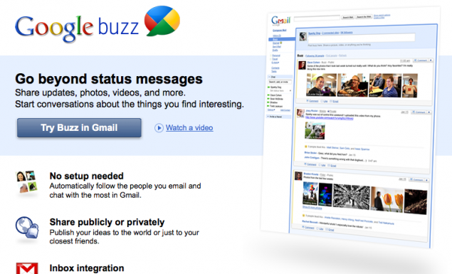
Tech: Good Google Buzz vs. Bad Google Buzz (the bad is mostly PR)

  • We’ve been playing with Google Buzz since last night, and we see a lot of potential here. It builds on some already solid foundations, and does things that prior players in this field – specifically FriendFeed – couldn’t do because of lack of scale. That said, we think Google has PR problems that Buzz largely amplifies. Here are our thoughts:

Google’s Good Buzz

  • It has users! Google handled Buzz’s launch better. Wave introduced its platform without users, so while it was technically adept, it gave users no incentive to join. Buzz solves that problem by plugging into Gmail’s wide usership.
  • It’s easy-to-use Another big problem with Wave is that while it was technically executed well, it was so complex to use that Gmail users couldn’t grasp it easily. Buzz’s interface is simple by design. There are options, but they’re fairly simple.
  • It notifies! Perhaps the biggest mistake that Wave made was that it had no built-in notify feature via e-mail; it was designed to replace it, really. You had to check it to see if people were bugging you. Buzz is tied directly to e-mail.

Google’s Bad Buzz

  • Do we need another? If Google had created Buzz three years ago, it would have seemed revolutionary. Now it just seems like Google’s trying to catch up. Facebook has this market cornered; why spend time focusing on this specific angle?
  • It eats wave’s lunch Even with all the differences, most users will compare Buzz to Wave. Many people already see Wave as a failure because it never answered a simple question: Why? Buzz is closer to that answer, but the effect is that it neuters Wave.
  • Can’t make up its mind The biggest problem Google faces is one due to its size. Google is so big that they try get involved in everything. Apple is successful right now because their decisions are deliberate. Google’s aren’t, and they seem indecisive. source

06 Nov 2009 21:00

tags

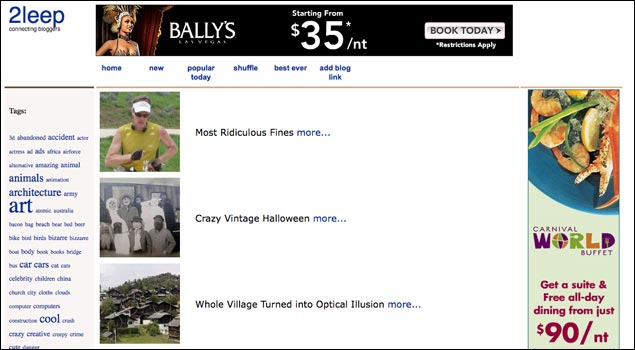
Tech: Check out blogger tool 2Leep, now with a fresh redesign by us!

2leep1106a

Here's the before: 2Leep.com is a blogger link exchange service used by such well-trafficked blogs as Oddee and The Inquisitr. Despite being around only a handful of months, it's gained a lot of momentum of late and is a great way to find neat, often bizarre articles. Despite its great idea, its design didn't really do the site justice. A total diamond in the rough.


2leep1106b
  • Here’s the after: We offered our services to 2Leep pro bono, because we thought we could help a lot of sites by giving this neat idea a design that matched its ambitions. We’re still working (beware of falling bugs, especially if your browser starts with the letters I and E), but the basic idea behind the layout was to give it a more web-appy feel as well as organize and emphasize the often-bizarre and cloying subjects the site covers. Check it out and please let us know if you see any issues. And keep an eye out for 2Leep links on ShortFormBlog!source
 

03 Sep 2009 10:53

tags

24 Aug 2009 11:08

tags

Tech: Slate cuts the crap, just gives you the Slatest news, simply.

  • And good for them. Really. OK, we’re kinda sad because it appears they’ve stolen our idea to some degree, but Slate’s newest site, The Slatest, is a news aggregator that doesn’t get bogged down by lots and lots (and lots) of links, like, say, Digg, Reddit, The Huffington Post, The Drudge Report, and … we could go on. A handful of really good news stories, linked in such a way that you know what you’re clicking, with a giant freaking ad that doesn’t get in the way. We approve. Good show, Slate. source

03 Aug 2009 10:35

tags

Tech: TechCrunch vs. Apple: The tablet PC wars are about to heat up

  • $400 expected cost of the CrunchPad, a simple-as-heck tablet produced by the TechCrunch dudes source