Read a little. Learn a lot. • Tightly-written news, views and stuff • Follow us on TwitterBe a Facebook FanTumble us!

12 Jan 2010 11:48

tags

Offbeat: Al Gore, while not president, is powerful enough to get a font changed

  • Well, in the book there’re a lot of examples of scientific nomenclature and this particular numeral one is causing confusion when it’s combined with capitals.
  • mgmtdesign designer “Michael” • Speaking to Typotheque about Al Gore’s desire to get a font – Brioni, which he picked for his book “Our Choice,” by the way – changed slightly, because it looked like a little capital “i.” So, they changed the number one for Al Gore. Awesome. source
28 Aug 2009 10:12

tags

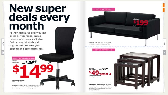
Biz: IKEA’s Verdana backlash: The Swedes didn’t see it coming

  • It’s more efficient and cost-effective. Plus, it’s a simple, modern-looking typeface. … I think it’s safe to say we were surprised by the response.
  • IKEA spokeswoman Monika Gocic • On the unthinkable change in font from IKEA’s iconic Futura variant to Verdana. The story’s starting to pick up some (trendy but cheap and wobbly) legs in the mainstream press, with Time now giving the story a little more exposure. Time did a good job covering the angles as to why Verdana sucks – it’s overused, it was designed for small sizes on the Web, and it’s way too associated with Microsoft. Hopefully the nudge in the press might help the company reconsider. • source

26 Aug 2009 20:46

tags

Biz: Verdana is not a font. We repeat, IKEA: Verdana is not a font.

The 2010 IKEA catalog

Verdana is a mistake. With all apologies to noted typographer Matthew Carter (who we saw speak a couple of years ago and have a lot of respect for), Microsoft has ruined his most well-known font. Its use has become such a sign of amateurism that we consider it a mistake. So its usage in the IKEA catalog, above, requires us to complain. Loudly.
  • Where it looks good Microsoft’s Web site. Internet Explorer interfaces. Computer screens. Body type. That’s about it. source
  • Where it looks good Microsoft’s Web site. Internet Explorer interfaces. Computer screens. Body type. That’s about it.
  • Where it looks bad Just about everywhere the IKEA catalog uses it. Big type. Bad tracking. The kerning sucks. The corners that make the font so distinctive turn in ways that scream personality in all the wrong ways. The catalog looks like something a first year design student at ITT Tech would make, which is the harshest criticism we could come up with. It looks like the font blew out when the catalogs were being printed. source
  • Where it looks good Microsoft’s Web site. Internet Explorer interfaces. Computer screens. Body type. That’s about it.
  • Where it looks bad Just about everywhere the IKEA catalog uses it. Big type. Bad tracking. The kerning sucks. The corners that make the font so distinctive turn in ways that scream personality in all the wrong ways. The catalog looks like something a first year design student at ITT Tech would make, which is the harshest criticism we could come up with. It looks like the font blew out when the catalogs were being printed.
  • The font in context Carter designed this typeface (along with Tahoma and Georgia) for a specific purpose in 1994 – to look good on a computer screen. A lot has changed since 1994. Most notably, we use LCD screens, not CRTs. Improved font rendering makes screens look nearly as good as print. We don’t need Verdana anymore. IKEA needs Futura, an iconic font it used for 50 years. Stupid Swedes. source

18 Apr 2009 19:14

tags

Offbeat, Tech: The guy behind Comic Sans talks about his reviled creation

  • If you love it, you don’t know much about typography. If you hate it, you really don’t know much about typography, either, and you should get another hobby.
  • Vincent Connare • The guy who created Comic Sans in the early ’90s. Connare made it for a singular purpose in Microsoft Bob and now the font has become the bane of the man’s existence. He currently works as a typographer for Dalton Maag. • source