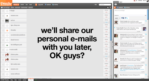
How it could be a contender, but so isn't yet. In a lot of ways, Threadsy wants to be the central point for Facebook, Twitter AND your e-mail. If someone pulls it off, they rule the market. Well, we just got a beta invite. And well, here's our initial thoughts: Threadsy is a smart idea undone by myriad technical problems and interface flaws which we feel undermine its usefulness. And if Threadsy wants people to use it, they need to fix these problems:
- Too much broken The private beta signup process was broken when we tried it. So was the front page. When it started working again, and we got to a menu to input our various accounts. Our GMail account didn’t take at first and gave an error. The Twitter login doesn’t use the password-protecting API. And Facebook Connect, which was buried within the interface, would keep dropping. Not to be harsh, but: Even for a beta, these flaws are too obvious and too disruptive. source
- Too much broken The private beta signup process was broken when we tried it. So was the front page. When it started working again, and we got to a menu to input our various accounts. Our GMail account didn’t take at first and gave an error. The Twitter login doesn’t use the password-protecting API. And Facebook Connect, which was buried within the interface, would keep dropping. Not to be harsh, but: Even for a beta, these flaws are too obvious and too disruptive.
- Too much control Threadsy asks for too much access. You feel OK with giving Threadsy your passwords at first, but then you realize you’ve given away the keys to a drunken teenager playing chicken. It decides which Twitter account you’re logged into on the Twitter Web site. Even if you log into a different Twitter account, it changes it back. Other similar services – HootSuite, Seesmic Web – don’t need to do this. Why should we hand Threadsy the keys? We’re not sure. source
- Too much broken The private beta signup process was broken when we tried it. So was the front page. When it started working again, and we got to a menu to input our various accounts. Our GMail account didn’t take at first and gave an error. The Twitter login doesn’t use the password-protecting API. And Facebook Connect, which was buried within the interface, would keep dropping. Not to be harsh, but: Even for a beta, these flaws are too obvious and too disruptive.
- Too much control Threadsy asks for too much access. You feel OK with giving Threadsy your passwords at first, but then you realize you’ve given away the keys to a drunken teenager playing chicken. It decides which Twitter account you’re logged into on the Twitter Web site. Even if you log into a different Twitter account, it changes it back. Other similar services – HootSuite, Seesmic Web – don’t need to do this. Why should we hand Threadsy the keys? We’re not sure.
- Too much blend The biggest problem with the service? Everything looks the same. The visual cues, including faint quote boxes and service-signifying icons away from where your eye is drawn, aren’t loud enough and get lost within hundreds of rows. We like how it pulls icons, but don’t like the fact that e-mail doesn’t have a threading option. That seems essential. If Threadsy wants to be a mixed-media inbox, the design needs to be more adaptive. source


