Read a little. Learn a lot. • Tightly-written news, views and stuff • Follow us on TwitterBe a Facebook FanTumble us!

24 Oct 2009 13:23

tags

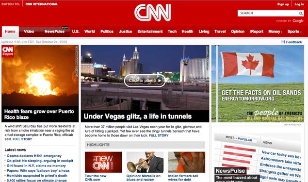
Culture: My, CNN, what a beautiful redesign you have. We love it.

CNN redesign
  • Could one make love to a redesign? Especially one of a news site that seems to go tabloidy more than it should? If so, we’d totally make love to the CNN redesign. It’s big and bold and red. Just like us.source
23 Oct 2009 14:23

tags

21 Oct 2009 21:09

tags

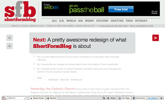
About: Big site news: ShortFormBlog’s redesigning, and other changes

redesign1021

We have big plans, guys. As you might remember a couple weeks ago, we asked you guys what you wanted. In part, that's because we have some big plans for the site's future. To start with, we have a redesign ready to launch November 3. Here's a little about the redesign, and some other changes:
  • Why the redesign? ShortFormBlog has been in existence for ten months, and we’ve learned a lot. And in many ways, the site’s focus evolved in ways that the original site didn’t anticipate. Mainly, we wanted a cleaner format that made the bite-sized elements work as well throughout the site as they do on the front page. To emphasize these changes, we’re flipping the slogan from “writing a little, saying a lot” to “read a little, learn a lot.” Small, but notable.
  • Why the redesign? ShortFormBlog has been in existence for ten months, and we’ve learned a lot. And in many ways, the site’s focus evolved in ways that the original site didn’t anticipate. Mainly, we wanted a cleaner format that made the bite-sized elements work as well throughout the site as they do on the front page. To emphasize these changes, we’re flipping the slogan from “writing a little, saying a lot” to “read a little, learn a lot.” Small, but notable.
  • Sports: Outta here One of the things that we’ve wrestled with more than anything is a way of paring down the site’s elements in smart, clear ways. For that reason, we’ve chosen to take out a piece of the pie that’s fallen by the wayside. Sports will not be part of the redesign. By cutting off a finger, we hope to make the hand stronger or something. But in the future, we have other plans for sports. And we want to bring readers on board to help.
  • New content, kids! One thing that we will be adding to the site is a weekly editorial comic by Shawn Vulliez. Vulliez, a fan of the site, created the animation for one of the most well-known and popular Flash clips of all time, “The Ultimate Showdown of Ultimate Destiny.” The comics are just a start, we hope. Our long-term goal is to figure out ways, both big and small, to get more contributors on board. Bug us if you’re interested.

26 Aug 2009 20:46

tags

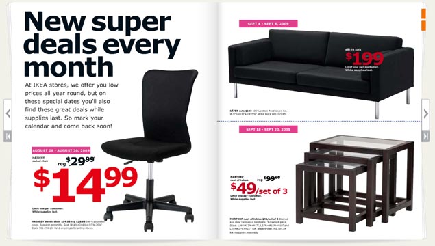
Biz: Verdana is not a font. We repeat, IKEA: Verdana is not a font.

The 2010 IKEA catalog

Verdana is a mistake. With all apologies to noted typographer Matthew Carter (who we saw speak a couple of years ago and have a lot of respect for), Microsoft has ruined his most well-known font. Its use has become such a sign of amateurism that we consider it a mistake. So its usage in the IKEA catalog, above, requires us to complain. Loudly.
  • Where it looks good Microsoft’s Web site. Internet Explorer interfaces. Computer screens. Body type. That’s about it. source
  • Where it looks good Microsoft’s Web site. Internet Explorer interfaces. Computer screens. Body type. That’s about it.
  • Where it looks bad Just about everywhere the IKEA catalog uses it. Big type. Bad tracking. The kerning sucks. The corners that make the font so distinctive turn in ways that scream personality in all the wrong ways. The catalog looks like something a first year design student at ITT Tech would make, which is the harshest criticism we could come up with. It looks like the font blew out when the catalogs were being printed. source
  • Where it looks good Microsoft’s Web site. Internet Explorer interfaces. Computer screens. Body type. That’s about it.
  • Where it looks bad Just about everywhere the IKEA catalog uses it. Big type. Bad tracking. The kerning sucks. The corners that make the font so distinctive turn in ways that scream personality in all the wrong ways. The catalog looks like something a first year design student at ITT Tech would make, which is the harshest criticism we could come up with. It looks like the font blew out when the catalogs were being printed.
  • The font in context Carter designed this typeface (along with Tahoma and Georgia) for a specific purpose in 1994 – to look good on a computer screen. A lot has changed since 1994. Most notably, we use LCD screens, not CRTs. Improved font rendering makes screens look nearly as good as print. We don’t need Verdana anymore. IKEA needs Futura, an iconic font it used for 50 years. Stupid Swedes. source

24 Aug 2009 22:51

tags

Tech: Yahoo: Screw it, might as well make our search super-simple

See a trend? Just like the competition, Yahoo’s search page now has almost nothing on it. They revamped lots of other stuff, too. source

25 Mar 2009 00:03

tags

Tech: Facebook’s tweaking their redesign so you guys stop complaining

  • Since Facebook started in 2004, we’ve been through several redesigns. Each was built with the intention of making it easier to share and understand what’s going on with the people you care about.
  • Facebook Director of Product Christopher Cox • On the redesign and changes they plan to make to the redesign. People are complaining a lot about this one, so they’re making changes. But they’re not reverting back to the old design, so get that thought out of your little head. • source

14 Mar 2009 14:04

tags

Politics, Tech: What does the Internet think of the Facebook redesign?


14 Mar 2009 13:31

tags

Tech: We’re one of the cool kids with the Facebook redesign (finally)

The front page redesign is up. In case you’re wondering, I’m probably not going to any of my five invited events. source

09 Mar 2009 00:49

tags

Music, Politics: Our rating of the redesigned Pitchfork Web site

09 Mar 2009 00:42

tags

Music, Politics: Pitchfork redesign: Uber-clean, no blue stuff overload anymore

The Onion A.V. Club wanted to do this with their redesign. But Pitchfork actually did it. It rules. source