Read a little. Learn a lot. • Tightly-written news, views and stuff • Follow us on TwitterBe a Facebook FanTumble us!

30 Dec 2009 21:36

tags

Tech: Slowly but surely, web font solution Typekit’s getting better

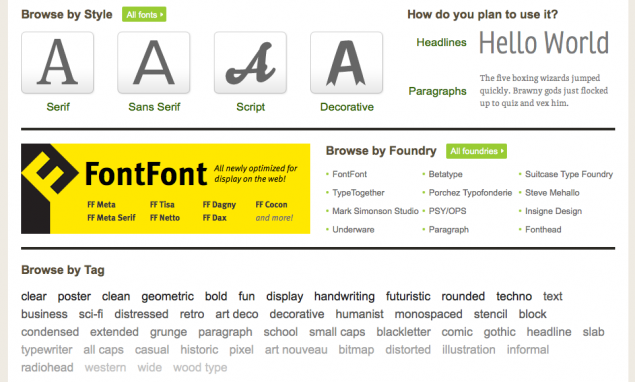
  • To give credit where credit is due: We really like the direction Typekit’s Web interface is headed. It’s very clean and well-organized, it’s easy to use, and it works like a snap. Keep it up, guys. Between this and Kernest (which we use and have lots of nice things to say about), the Web font game is starting to get very interesting. source

30 Aug 2009 21:28

tags

Tech: The importance of knowing Kernest: Pretty high. Your move, TypeKit.

Hi guys! I'm Chunk. (Unless your browser doesn't support font-face. Then I'm Helvetica Neue.) I'm SFB's new logo font. I'm coming soon. But thanks to Kernest, I'm making an early appearance. Whoo!
  • A week and a half ago, we tried out this new service called TypeKit, and noted a few things about it: It costs money, it’s currently invite only, and it uses a tiered font system. It seemed pretty cool nonetheless. Then we tried Kernest. And we have to say, Kernest simply does it better.

    Why’s that, ShortFormBlog? There’s fewer, less confusing barriers to entry, it doesn’t use Javascript (very key), it costs less (even more key) and (best of all) the DRM is less complicated.

    A la carte, not subscription. Right now, Kernest’s selections are largely open-source, freeware or donationware. Most of TypeKit’s selections are big commercial fonts. We think this is mostly an exposure/hype thing rather than a quality thing, because TypeKit’s been a Twitter trending topic a few times. We’re convinced that they simply need attention from the media.

    It’s not perfect yet, though. Our biggest complaints about the service at the moment all relate to the interface: Simply put, this list needs to be more like this list, and it needs to be more intuitive overall. In our opinion, TypeKit’s interface is a little cleaner from the backend. (But on the other hand, Kernest doesn’t hide its assets from the user for trial viewing, as we found with TypeKit’s list with no links.) But what Kernest is offering seems to be just a little better on the frontend. What do your users care about? Seriously? source

19 Aug 2009 20:49

tags

Tech: We have an invite to Typekit. Here’s a sneak peek.

Here it is in action. It's not cheap. But it sure looks neat, doesn't it, guys?
Here's a lineup of costs:

Trial: Free (but you only get to use two fonts out of a mediocre collection, lame icon in the bottom corner – see below)
Personal: $7/month, $24.99 launch special (bigger collection, up to five fonts)
Professional: $17/month, $49.99/year launch special (bigger collection, unlimited fonts)
Corporate: $49.99/month (pretty much the whole kit and kaboodle)

Did they pull it off?:

They did their homework. The prices are fairly reasonable for web developers. The interface doesn't suck. The rendering, while good, isn't perfect (but that's more a Web browser problem than anything). And the DRM doesn't seem so overwhelming that you can't enjoy the technology for what it is. Good for them. Source