A former XXL Magazine editor says yes.The Huffington Post, which exploded in popularity in the last year, is perhaps an odd model for a hip-hop Web site, but Elliott Wilson says RapRadar.com can pull it off. The site, which launches March 9, will attempt to combine the worlds of blog gossip and news, just like HuffPo. And it helps that the mag has cred and money behind it: Eminem’s manager, Paul Rosenberg, is backing it, and Wilson is publishing an authorized bio of Jay-Z next year. So he can probably get those guest celebrity columns, too. source
What we like The header font is a nice, cool slab serif, and you know how we feel about dotted lines here at ShortFormBlog. This is one of our favorite Web sites, and we want to see it do well, so we’ll visit it anyway, but … source
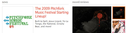
What we like The header font is a nice, cool slab serif, and you know how we feel about dotted lines here at ShortFormBlog. This is one of our favorite Web sites, and we want to see it do well, so we’ll visit it anyway, but …
What we don’t like Too much freakin’ white space in all the wrong spots. The previous design felt very efficient in its usage of white space and its bold use of images. Here, the images are smaller and less meaningful, the page is far too vertical, and it just feels like there’s a heck of a lot of wasted air. To put it simply, it feels unfinished. Agree, disagree? Leave a comment. source