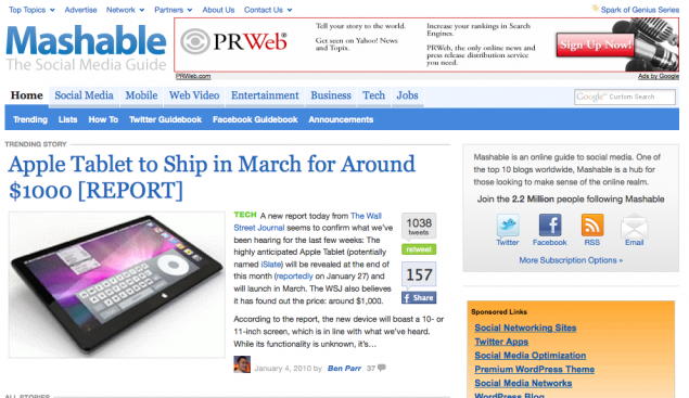
- They look like the establishment now. Mashable’s always had a lot of clutter in its design, due to the fact that they tended to try a lot of things and throw them on the wall and see if they worked. It’s what the site’s always been about. They did need a redesign, and we’re glad they’re trying. But we’d rather have the old design back than this slick hodgepodge that feels like absolutely nothing at all.
- Why does it suck? The colors of this design are so quiet, so muted, so similar to Yahoo!’s longstanding mid-decade quiet tones, that it doesn’t make us feel anything. Also worth noting: The headshots, which emphasized that this was a personality-driven site, have been de-emphasized too much, creating an anonymous, generic feel.
- Changes worth considering Mashable’s a popular site, but it could stand to be hipper (like Engadget, which just got a great redesign) or more playful (like Twitter, which drives much of the site’s traffic). It should have as much personality as the words of its jetsetting founder, Pete Cashmore. Cleaner doesn’t mean lifeless. Never forget that, kids.
Posted by Ernie Smith •
Permalink
