Read a little. Learn a lot. • Tightly-written news, views and stuff • Follow us on TwitterBe a Facebook FanTumble us!

10 Aug 2011 20:13

tags

Culture: J.K. Rowling’s Pottermore = Kinda like Beatlemania

  • A first look at Pottermore: While the latest project from J.K. Rowling isn’t quite ready to be released, the BBC was able to get a glimpse at some of the site’s features. Here’s a peek at Ollivander’s wand shop and some of 4 Privet Drive. source
31 Aug 2010 21:34

tags

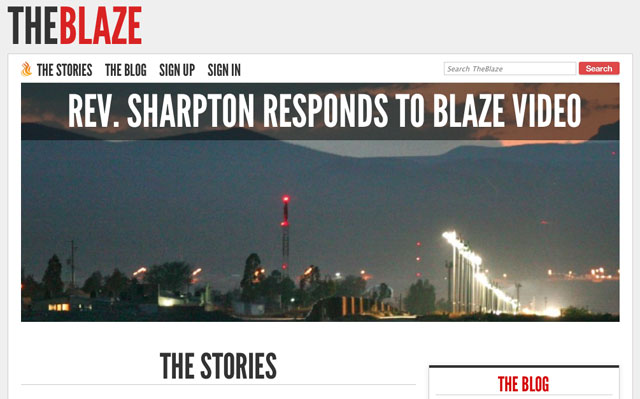
Politics: Glenn Beck’s “The Blaze”: Well, the design is kinda cool

  • Credit where credit’s due: The Blaze, clearly Glenn Beck’s attempt at a Huffington Post-style site, has a design that tops pretty much every site of its kind out there. HuffPo is an exercise in throwing a ton of crap on a single page. The Daily Caller, while it had an engaging pitch at launch, definitely had a by-the-numbers design that looked out of date before it had ever heard of Journolist. The Blaze, while sticking with WordPress, has a downright elegant, photo-heavy, type-focused look. Too bad it’s as adversarial and divisive as Beck can be. source

02 Mar 2010 10:13

tags

Biz: The BBC gets criticized for overreach, then scales back big time

  • 25% the amount the broadcasting company, which is subsidized by the British government, plans to cut its spending over the next few years
  • half of its Web pages will go bye-bye in the shake-up, along with BBC 6 Music, an alternative music radio station, and one other radio station
  • why? the broadcaster got a lot of criticism for moving away from its original purpose and competing with commercial networks source

07 Jun 2009 21:47

tags

Biz, Tech: Why do some corporate web sites look like giant clusterducks?

americanairlines0607
  • After graphic designer Dustin Curtis took American Airlines to task for having a terribly-designed site, an interface designer for the airline claimed it wasn’t his fault, but a horrendously broken corporate structure. (And yes, we used “clusterducks” in the headline on purpose.)source