Read a little. Learn a lot. • Tightly-written news, views and stuff • Follow us on TwitterBe a Facebook FanTumble us!

10 Nov 2010 10:23

tags

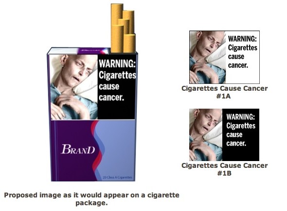
Culture: FDA’s graphic cigarette warnings: Poorly-designed, depressing

  • There are many many others that the FDA wants to put on the sides of packs of cigarettes, and some are amazingly depressing. The problem with these labels is that the design of many of these looks downright amateurish, like they just got a bunch of random stock photos to use. Would a marketing campaign make more sense? We sense a meme coming on. source

06 Nov 2010 15:18

tags

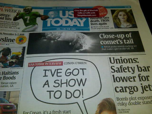
Culture: USA Today used Comic Sans on its front page Friday. NOOOOO

  • NO. NO. NO. NO. No. No. No. This is wrong. No. USA Today needs to stop doing this. Not even Conan can make this usage desirable. (Thanks to Danny Unruh, @kstateunruh for the image)

23 Oct 2010 19:41

tags

Biz: Citibank’s multifunction credit card design misses the point

  • The new credit card?For the most part we’ve been using the same credit technology for 60 years, at least in the U.S. That magnetic stripe has proven pretty durable. So Citibank is introducing multi-button cards like these starting next month, which (among other things) will allow you to tie multiple accounts to the same card.

    What’s the point?Sorry, but we think that the design of the cards shown here is downright laughable, and technologies like Visa’s Paywave and Square are both out in the wild already and way more useful. We want less, not more, complication at the checkout. The new credit card isn’t a multifunction monster. It’s a cell phone. source
25 Sep 2010 17:39

tags

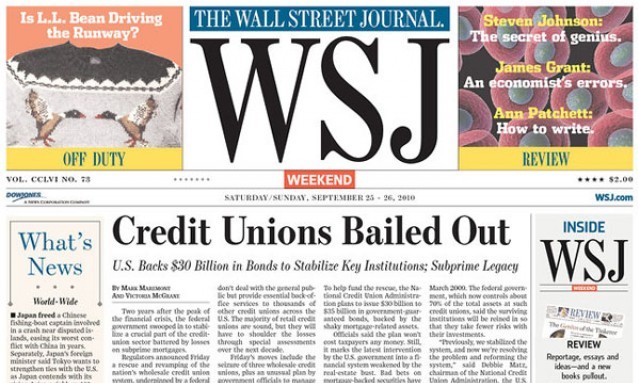
Biz: Wall Street Journal as “WSJ”: You can see it from miles away

  • We blame Rupert Murdoch. One of the great icons of traditional American journalism has decided to take a design cue straight out of a 5,000-circulation weekly, taking a once-simple nameplate and making it REALLY REALLY BIG for their new weekend editions. Our buddy Charles Apple had the right thought on this whole thing, referring to the change with the headline “‘WSJ’? WTF”. It’s probably one of the worst design decisions by a major newspaper in a long, long time. It’s harsh, but honest. source

03 Nov 2009 21:06

tags

Politics: George Hutchins for Congress ’10: A campaign that knows design

georgehutchins1103
  • From North Cackalackly to Congress. Any man from North Carolina who can use the Impact font with this much, uh, IMPACT, deserves to be in Congress. We hope he gets elected. Then we hope he ends up taking shots in a Capital Hill bar with Alan Grayson. Then, we expect him to redesign our site. We’ll be ready for ShortFormBlog 3.0 by the time America is ready for this bastard to take office. Does he do freelance? source