Culture: FDA’s graphic cigarette warnings: Poorly-designed, depressing
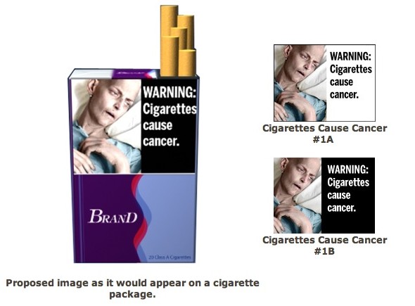
- There are many many others that the FDA wants to put on the sides of packs of cigarettes, and some are amazingly depressing. The problem with these labels is that the design of many of these looks downright amateurish, like they just got a bunch of random stock photos to use. Would a marketing campaign make more sense? We sense a meme coming on. source
