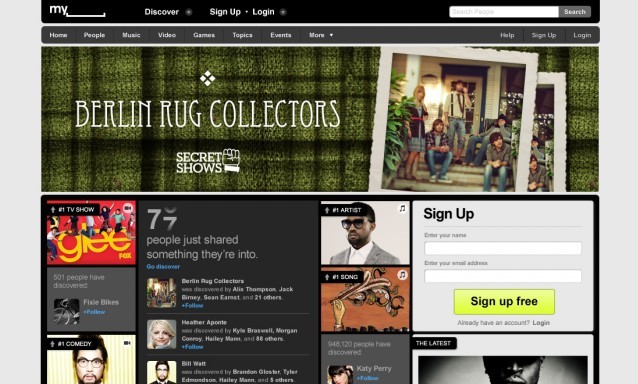
Tech: MySpace’s new redesign: Better than that crappy logo
- This may lose us cool points, but we hate the logo and love the design of the new MySpace site. It’s clear that they actually gave designers a lot more freedom, and now it looks like somewhere we wouldn’t be embarrassed to find ourselves. We also hear that they’re limiting the amount of freedom you can have with individual page design, to which we say about freaking time! Leave the design to the designers, or at least set a high bar like Tumblr does. source
