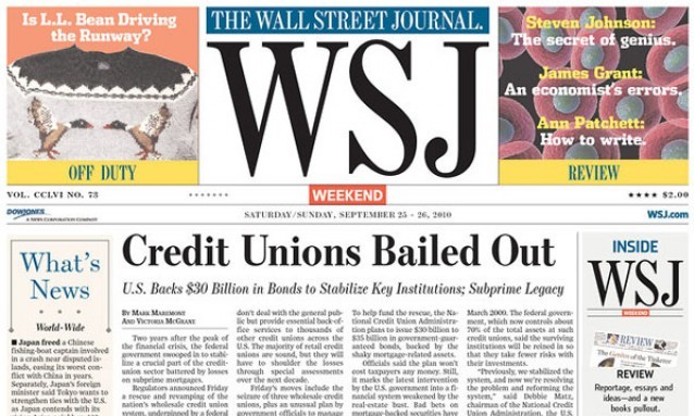
- We blame Rupert Murdoch. One of the great icons of traditional American journalism has decided to take a design cue straight out of a 5,000-circulation weekly, taking a once-simple nameplate and making it REALLY REALLY BIG for their new weekend editions. Our buddy Charles Apple had the right thought on this whole thing, referring to the change with the headline “‘WSJ’? WTF”. It’s probably one of the worst design decisions by a major newspaper in a long, long time. It’s harsh, but honest. source
Posted by Ernie Smith •
Permalink
