 Earlier this week: Gap The Gap, an ultra-iconic, ultra-basic brand of basic clothing, decided to redo its logo to look like every other logo on the Internet. People hate it. The company tries to crowdsource a new logo. People complain about that too.
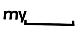
 Today: MySpace Apparently looking to up the ante, MySpace takes a cue from AOL and redesigns their logo in such a way that it can use secondary art. Too bad they took out the word “space” and replaced it with a madlib. source
Posted by Ernie Smith •
Permalink
 Earlier this week: Gap The Gap, an ultra-iconic, ultra-basic brand of basic clothing, decided to redo its logo to look like every other logo on the Internet. People hate it. The company tries to crowdsource a new logo. People complain about that too.
 Today: MySpace Apparently looking to up the ante, MySpace takes a cue from AOL and redesigns their logo in such a way that it can use secondary art. Too bad they took out the word “space” and replaced it with a madlib. source