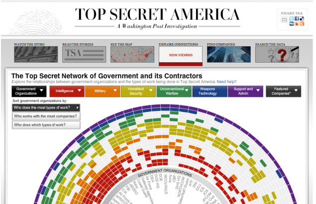
- The amount of work that went into this is impressive. Beyond the stories themselves – an early Pulitzer contender about how the government’s intelligence apparatus has grown so huge that nobody knows how big it is – is an immaculately-designed mini-site, full of huge amounts of data about where all that intelligence money goes. It includes a pretty smart use of the jQuery carousel feature, immersive graphics (above), and data to last you for weeks. The Post has long been the ugliest of major old-guard newspapers, cluttered in all the ways that the Post itself is clean and classy. This – to us – proves that they have the capacity to turn that ship around. (Edit: Scott Clevenger notes that this series will also become a Frontline special on PBS.) source
Posted by Ernie Smith •
Permalink
