Tech: Early thoughts: The iPad as news curation tool (is it worth it?)
- Our take? It depends on the app. Right now, the iPad does three things really well. It allows you to surf the Web at nearly the same clip as a laptop, it rules at non-Flash video playback, and it allows you to read the news better than either a newspaper or Web browser. For a 1.0 product, this is polished. But we’re journalism nerds that read a lot of links, so let’s focus our appeal. How is reading and curating news on this thing, anyway? (Hint: Pretty good.)
First: What a good news app needs
- one A simple format that makes it easier, not harder, to read the news. It’s not a newspaper or a Web site; it’s a little of both
- two An easy way to share content – you should be able to copy quotes, tweet links, and e-mail articles to a friend (or yourself)
- three A solid offline reading mode – these apps need to be able to work without a wi-fi connection nearby; all of the apps had this
Second: The best news apps
- best The Reuters app is
super-readable,
easy to scan, and
best-formatted for
the iPad. It’s also
the one that tried to
look least like a
newspaper. - great The USA Today
app has a mix of
strong readability,
easy organization,
and smart uses of
swiping. It’s nearly
as good as the
Reuters app. - eh The New York
Times app isn’t
bad, but its body
type isn’t on the grid. The Wall Street Journal app tends to overreact
to tiny movements. - wtf The Associated
Press app went all
scrapbook with
their format, which
is OK – for a
scrapbook. For
reading hard news,
it’s very annoying.
Third: Twitter on the iPad

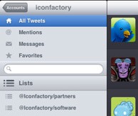
Best balance Twitterrific was designed for the iPad the way that one would expect someone to use an iPad Twitter app. The use of Twitter lists, for example, makes for great news-reading. Less is more in this case.
Most complex TweetDeck could stand to be a little less complicated right now. It loads too many windows at once and comes across as a bit bloated and overwhelming. A bit more interface furniture to clean up the look would help this greatly.
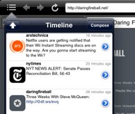
Best mashup As many people know, the EchoFon/Firefox setup is hard to top for reading linked tweets, and TweetBrowser goes a long way to replicate that on the iPad. Only issue: We wish we could hide the feed in the horizontal format.
- » One side note: Webkit’s skills at rendering the Twitter web apps are mostly pretty good. The web version of Hootsuite is actually better than the iPad-native version of TweetDeck on the iPad. Threadsy also works great, as does the Web version of Seesmic. You’ll have to use a two-finger swipe to navigate, though, which can be cumbersome.
Overall: What did we think?
- » What we like: It’s a good reading format, and Safari could handle nearly everything we threw at it (except the TinyMCE rich-text editor, which means it sucks for blogging because WordPress uses that). The format is awesome for video and music. Once Hulu and Spotify get apps on here, it’s seriously a one-stop shop. Also, being able to load articles on the device and take it on the wi-fi-less D.C. Metro was downright perfect.
- » What we don’t like: It can be hard to hold the device upright, especially if you’re not sitting at a table. It’s strange that Apple didn’t consider putting a kickstand on the back. The keyboard is usable but not heavy-duty. Apple should consider putting in (or allowing) additional keyboard setups that make it more usable for typing in HTML. Right now, it’s a serious chore.
- » What we want to see: Surprisingly, we don’t miss multitasking on the iPad – it actually wasn’t noticeable for most apps. But we think someone needs to create a single app that mixes social media, web browsing and blogging/word processing. TweetBrowser gets the first two down, but WordPress‘ app isn’t designed for this at all. We smell opportunity (eh, Tumblr?).
