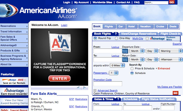
Biz, Tech: Why do some corporate web sites look like giant clusterducks?
- After graphic designer Dustin Curtis took American Airlines to task for having a terribly-designed site, an interface designer for the airline claimed it wasn’t his fault, but a horrendously broken corporate structure. (And yes, we used “clusterducks” in the headline on purpose.)source
